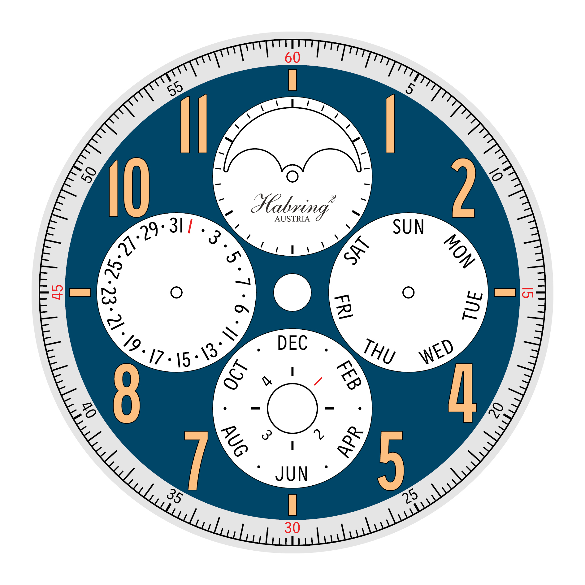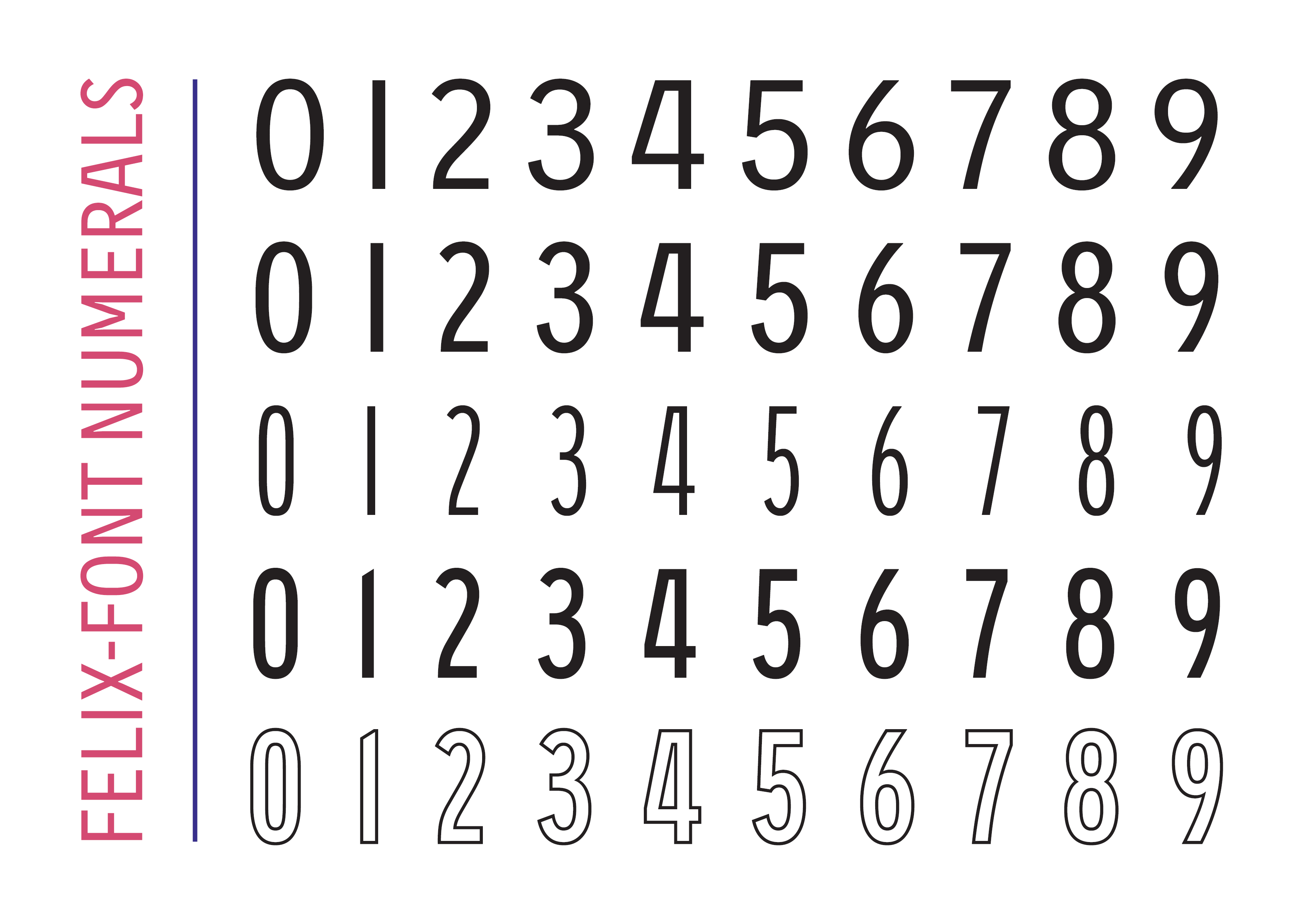
Felix-Font is a custom type family for the independent watchmaker Habring². The family was originally started as an expanded numeral set that was modeled after Habring²’s existing 12 numeral on their Felix watch. Additionally a set of filled outline numerals were created to refine the gilded applications which can be found on the Erwin and Doppel-Felix.
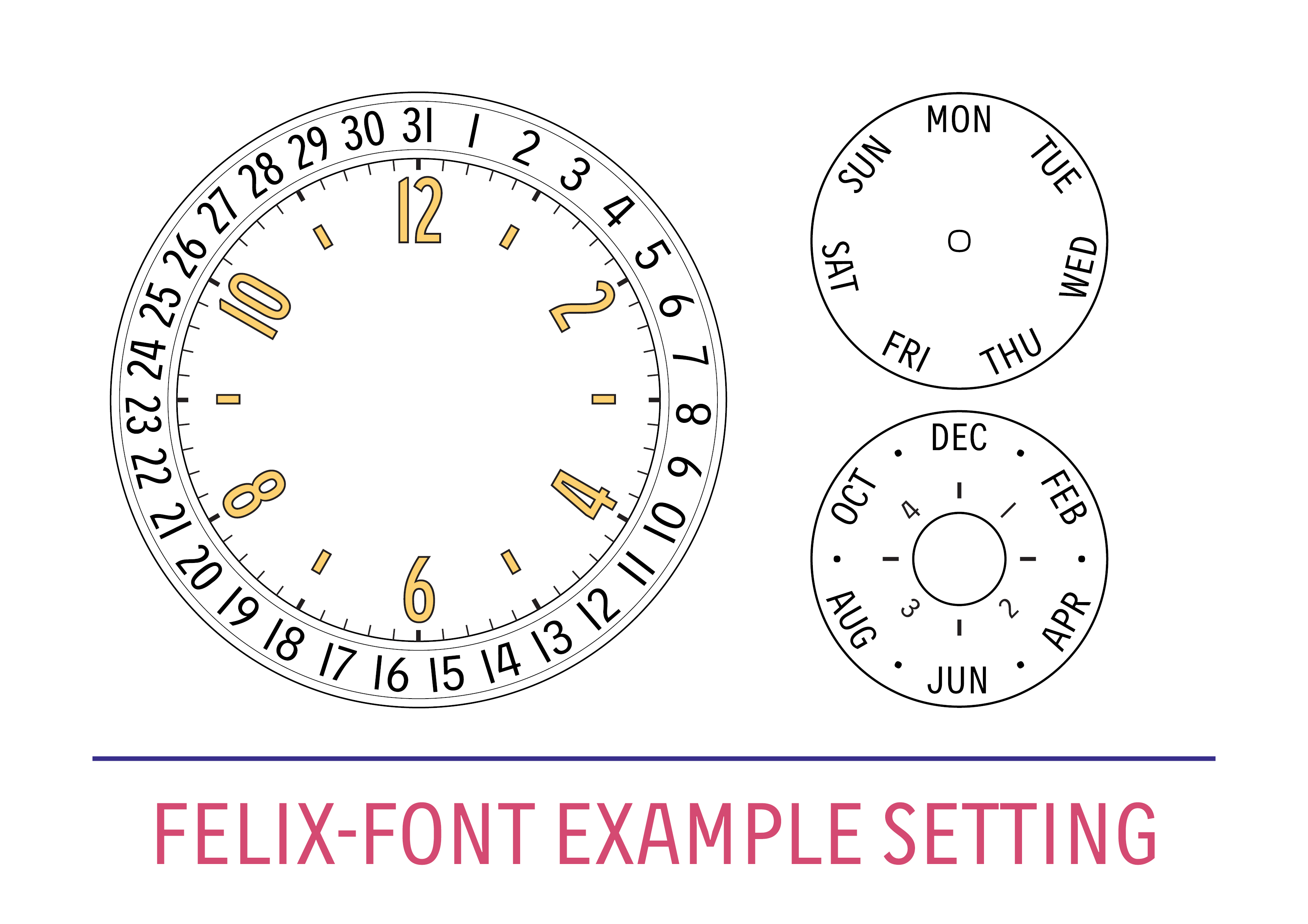
The next step was to create a set of semi-condensed and regular width numerals that could be used for date displays and sub-dials. The two widths were necessary to set a radial date display (see final image) so that the numerals from 20–31 could fit without being squished. Additionally a set of uppercase letters was created so that all dial indications could be laid out using Felix-Font. Applications include chronograph scales such as a tachymeter, telemeter, or pulsometer as well as calendar displays for months and days. The letters are semi-condensed and reference vintage watch typography, making use of a ‘flat-top A’ as well as optically monolinear construction and similar character widths. Wide fitting and ink traps are included to allow for cleaner printing at the small sizes found on watch dials. The goal with Felix-Font was to give Habring² a custom-made typeface that could replace their older fonts. The family needed to retain a neutral quality found in the rest of the Habring² timepieces, as well as reference mid-20th century horological typography.
Update 21 June 2019:
Felix-Font was debuted on the Perpetual-Doppel which you can read about here.


