In early 2021 I was commissioned by a collector to design a set of Chinese numerals for a customised Super1 from watchmaker Stepan Sarpaneva. This project provided many intriguing challenges beyond designing in an unfamiliar script. The style of numeral was largely up to me however the Super1 dial imposed quite a few constraints and considerations: There is the iconic Sarpaneva design language, the dial is also formed of a multipart construction using a milled base with a laser-cut upper frame holding the minute track and hour markers. The hour markers themselves are filled with Super-LumiNova (SLN) and while the regular Super1 uses simple baton markers, even the simplest style of Chinese numeral would be far more detailed.
Luckily there was a precedent in a previous Super1 that featured Hindu-Arabic numerals. This provided a consistent ‘frame’ for the numerals however the circular frames ended up being as much of a constraint as they were an aid. The laser-cut frame made it clear that any numerals with counters would need to be stenciled (see the numeral 5 above). The Hindu-Arabic Super1 also provided some scope in that the cardinal numerals (12, 3, 6, and 9) would not be featured on the dial. The client also specified that they would like the numeral 4 to be left out as it symbolises death in Chinese since the two words have a shared pronunciation. While this only left a few numerals to actually be made, I decided to design the full set in order to better define a consistent design language and to help with future implementations where more numerals may be used.
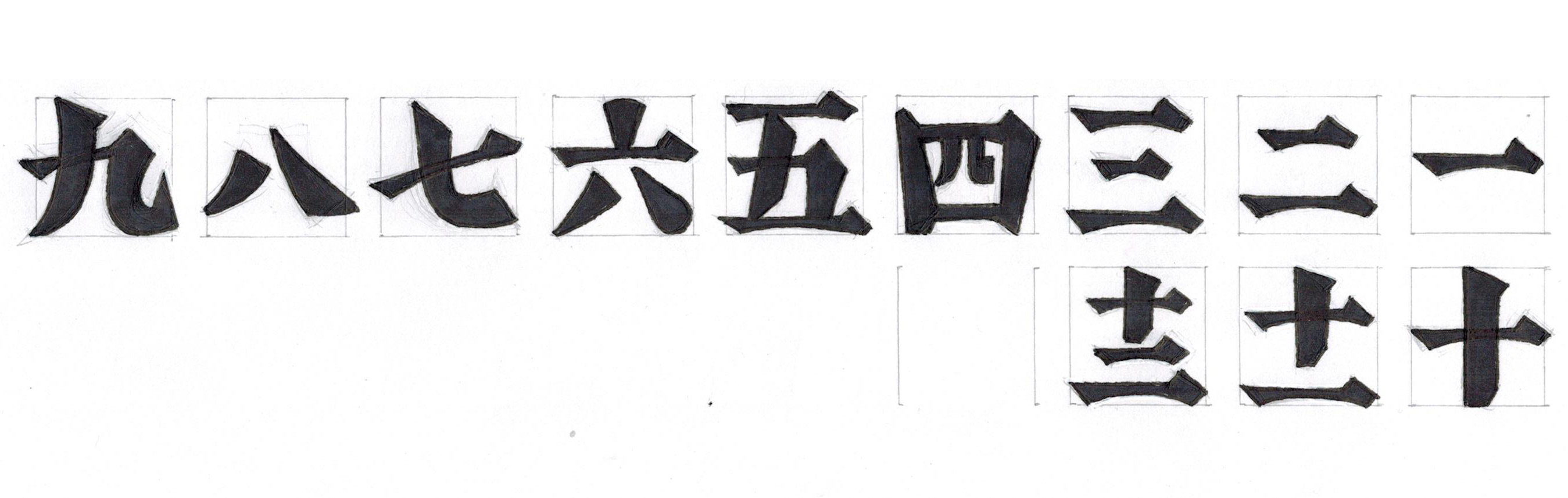
Since the Super1 uses strong geometrical forms with quite a bit of dimensionality in its dial, I determined that the numerals would need to be bolder than a light or text weight in order not to be lost. A bolder weight would also help in the manufacturing process as SLN has minimum tolerances in its application onto a dial. These minimum measurements are quite a bit larger than regular printed details. After discussing a number of different stylistic sketches, the client and I proceeded with a very bold, sharp style that was more inspired by woodcut characters than brush drawn ones. The sharp points at the corners of the strokes would contrast the rounded corners of Sarpaneva’s style, however the overall boldness of the numeral set aimed to match the robust nature of the watch.
Due to the circular hour frames of the Super1, more intricate numerals like 5 and 11 (as well as 4, 6, 9, and 12 if they had appeared on the dial) needed to be carefully handled so that they fit into the allotted space without forcing the rest of the numerals to appear too small. The 11 numeral needed special consideration to balance the ’10’ and ‘1’ characters in a way that did not deform them too much. In this regard, I am quite happy the Super1 is not a GMT or date watch so there was no need to design anything beyond 12; numerals for 13 and above would require radically different thinking.

I gave blunted ends to the sharpest corners in the construction of the numerals. While these corners would be minutely rounded by the laser cutter in the manufacturing process, the blunted corners helped to visualise how the SLN would fill the form of each numeral. The blunted corners and overall almost brutalist angularity of the numerals brought to mind W.A. Dwiggins’ ‘M-Formula’ in which sharp edges or angles in forms can be smoothed out by viewing from a distance whilst still maintaining an overall sense of energy.

The final order of business was to stencil the 5. Since the counters of the numerals could not ‘float’ in the middle of the filled SLN, stenciled lines were needed to connect the metal from the outside of the numeral into the counter area. Obviously this is not an ideal presentation of the numeral but I was tasked with figuring out how to stencil the 5 without breaking too many strokes. Terminating the left vertical stroke early was half of the solution, but it was necessary to break the bottom horizontal stroke in order to achieve the desired structural integrity.
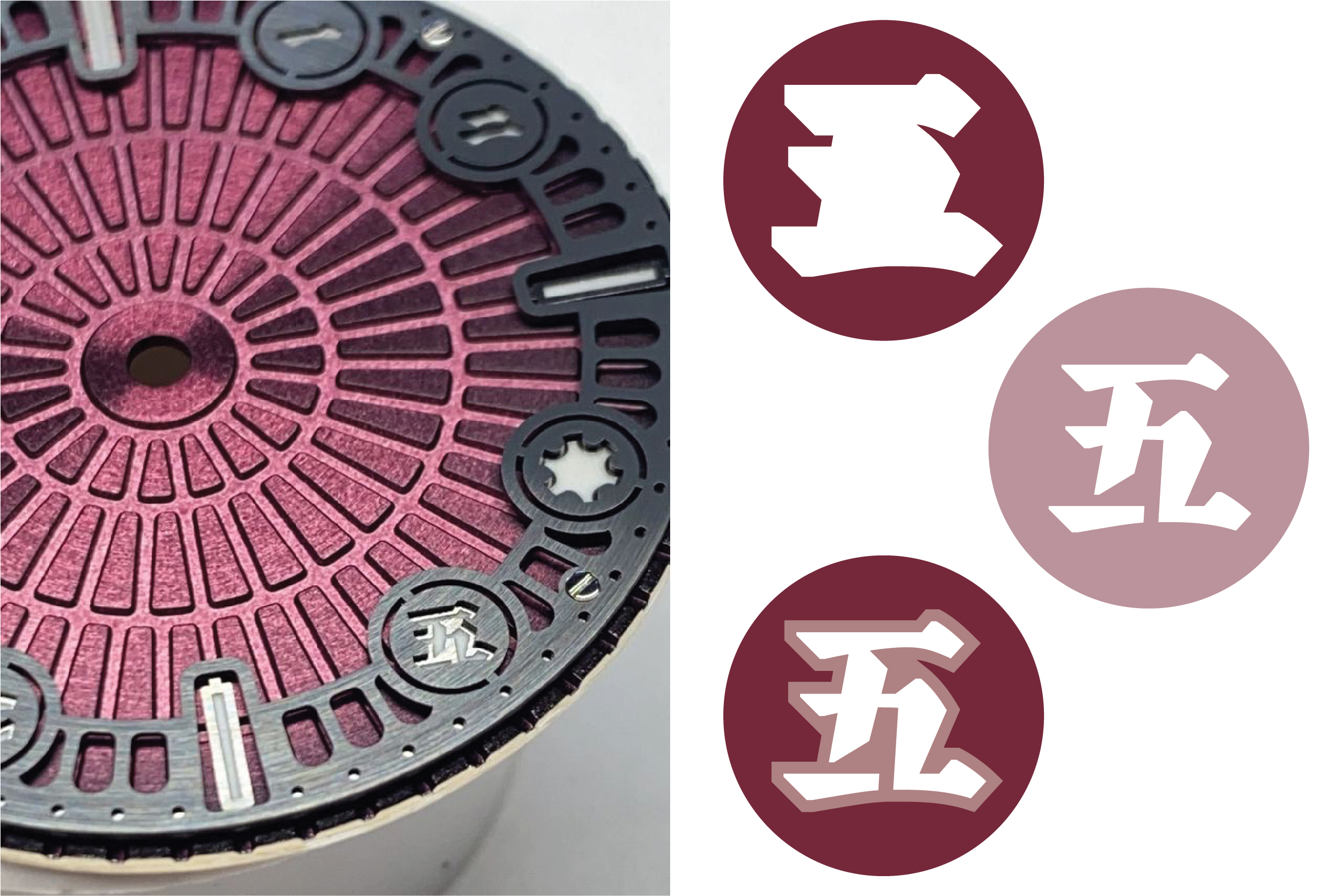
Once I submitted the finalised numeral set, Stepan determined their sizing on the dial. The SLN-filled numerals sit in a lower frame while an upper anthracite-coated ring contains apertures in an offset form from the outer contours of the numerals. This keeps the numerals visible and adds more detailed interest to the dial. After many months the watch was finally complete.
I would like to thank Xunchang Cheng, Hidetaka Yamasaki, and Sérgio Martins for their help and input on the design for these numerals.
