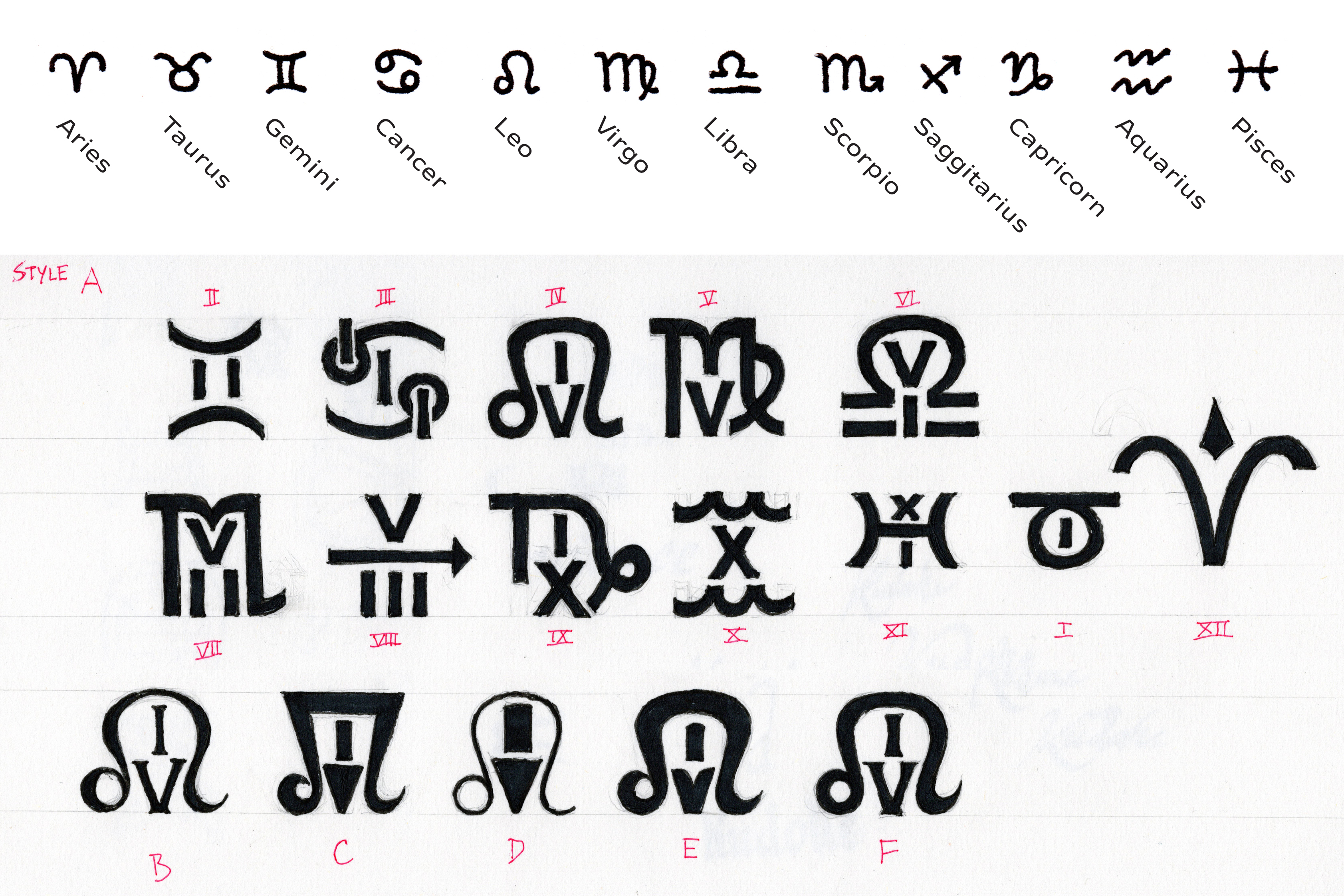
This project began in May of 2020 with a question: Could a set of numerals be combined with the symbols of the zodiac? The answer is engraved into the dial of the Kudoke 2 “Zodiac” for Watches by SJX. The blog Watches by SJX is celebrating its tenth anniversary this year with a series of limited edition collaboration watches. The first was a jumping seconds watch made by Habring2 and the follow-up is this watch made by the German independent watchmaker Kudoke.

The base watch for this project is the Kudoke 2 which tells the hours and minutes but also has a 24-hour indicator at 12 o’clock. I was brought in by Jiaxian Su, founder of Watches by SJX, to design a set of Art Deco style hand-engraved emblems that combined the symbols of the zodiac and Roman numerals. It was a daunting task simply trying to figure out a system that where the numerals and symbols could be combined cohesively and within the context of a watch: meaning curved base and cap lines as well as a small overall size.
While I could rely on conventions from the rich history of Roman numerals being used on timepieces to inform my own design, the zodiac symbols offer very little precedence (though you can find both on the Prague Orloj which dates back to 1410). The symbols are quite inconsistent in their construction which posed another problem, I didn’t want the dial to look too messy. After much sketching, I distilled the symbols into monolinear forms which allowed for easier experimentation of how they could be combined with the numerals, and how far I could stretch their proportions.
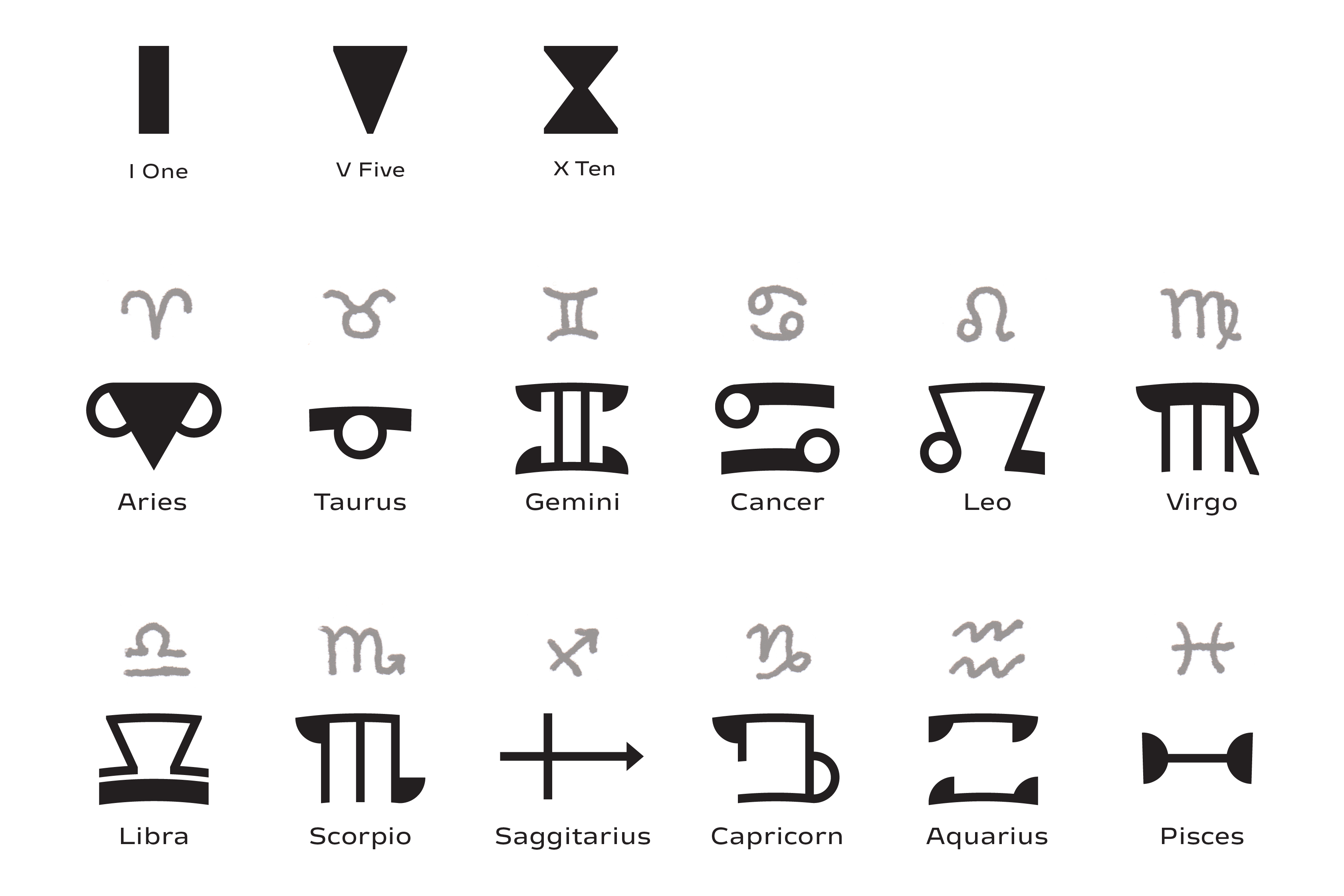
The order of which numerals were combined with which symbols was another consideration. The constellation for Aries is the first symbol of the zodiac and occupies 0° to 30° on the ecliptic longitude, while it is the first house in astrology, it is also given the number 0 rather than 1 in some astronomical works. Given that the watch has a 24-hour counter showing that the day starts at 00:00 rather than 01:00, I felt it was appropriate to assign Aries to 12 o’clock with the rest of the symbols following suit.
Some combinations turned out to be quite simple to incorporate such as II with Gemini however IX and X were less easy fits. Luckily since Aries was going to be placed on the rotating 24-hour disc, I didn’t need to worry about combining it with XII. I also decided to go against the convention of 4 o’clock being written as IIII rather than IV since the latter option fit better with Leo’s symbol and it rapidly became clear that this was not going to be a traditional-looking set of watch numerals.
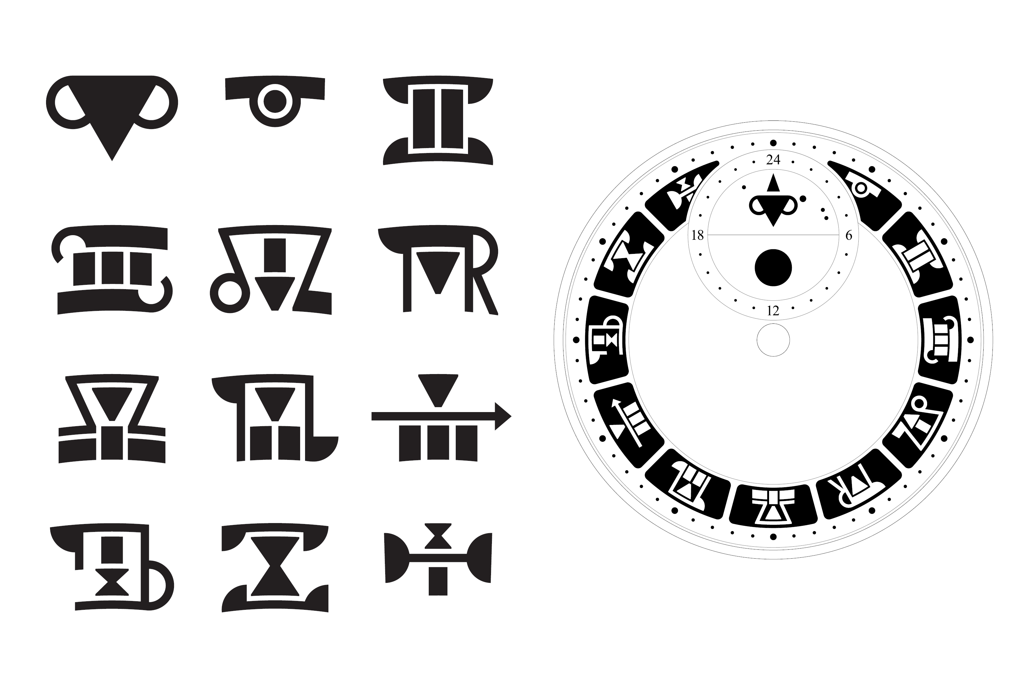
Once SJX, Kudoke, and I were all satisfied with how the numerals and symbols were working together structurally, I began to figure out the style. Knowing that the end result would be hand-engraved emblems, it was necessary to keep a sense of dimensionality in mind while creating further sketches. Having the emblems engraved in relief with a textured or stippled lower layer felt very attractive. I added a frame around each emblem to aid with organising the dial. There were always going to be a lot of shapes on the dial and the frames provided a border to keep each emblem in its place. Art Deco makes use of sharp angles and geometric patterns so I started to abstract the symbols into more rigid forms. This helped to build a cohesive design language for the set and it allowed for some very interesting shapes to take form. The numerals lost their monolinear construction and were further simplified in their structure.

Within the frame, the emblems are modular in construction. I identified where most of the strokes in the symbols could be placed, and which numerals needed to be stacked. With that information, specific guides were constructed for the strokes to follow. Details were consolidated and simplified into straight, diagonal, and circular forms. Once the building blocks were in place, I broke away from the guidelines where necessary to ensure each emblem felt balanced in its width and detail. While the numerals generally fall within the symbols, there is not a specific hierarchy as to which is more important, they are meant to work in synergy.
Even though the forms are not immediately identifiable, SJX noted during their development that the emblems allow the wearer to discover and recognise them in their own time. This type of typographic abstraction is something that holds great interest for me when it comes to designing numerals and letters for watches.
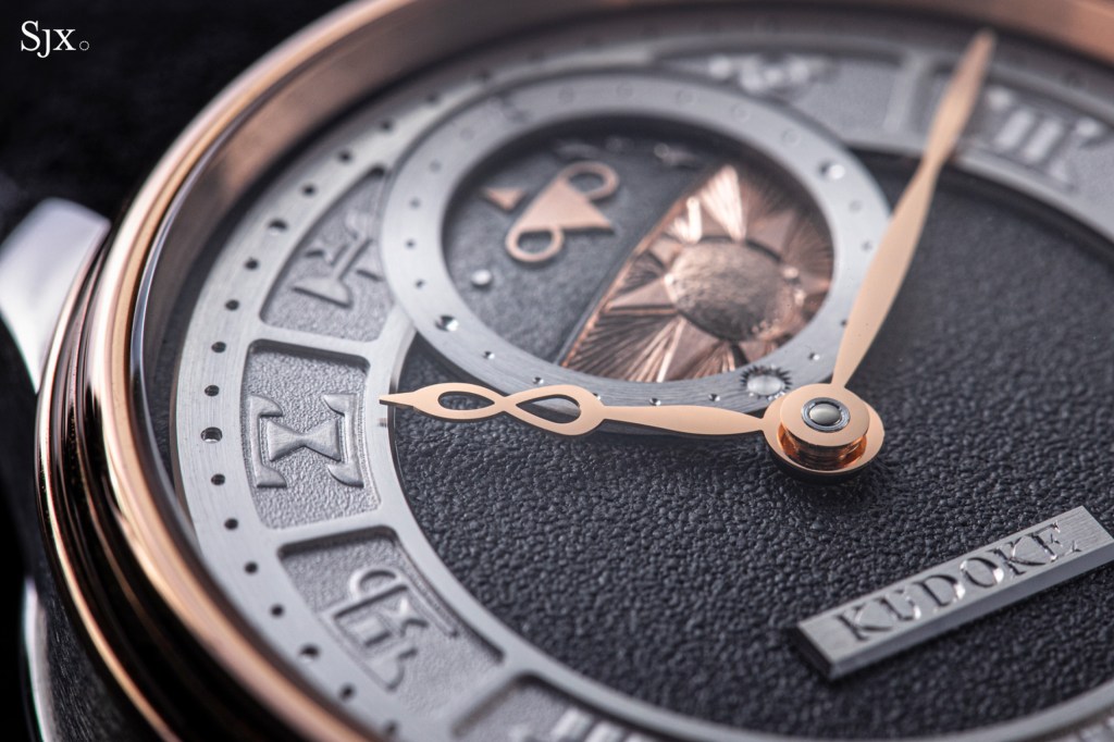
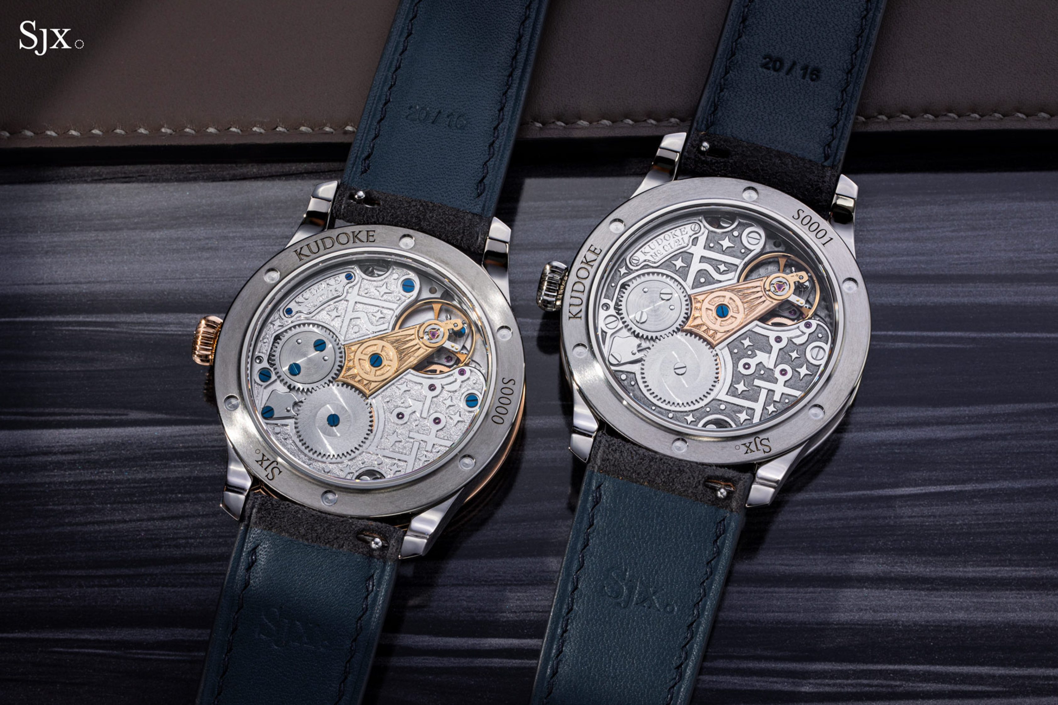
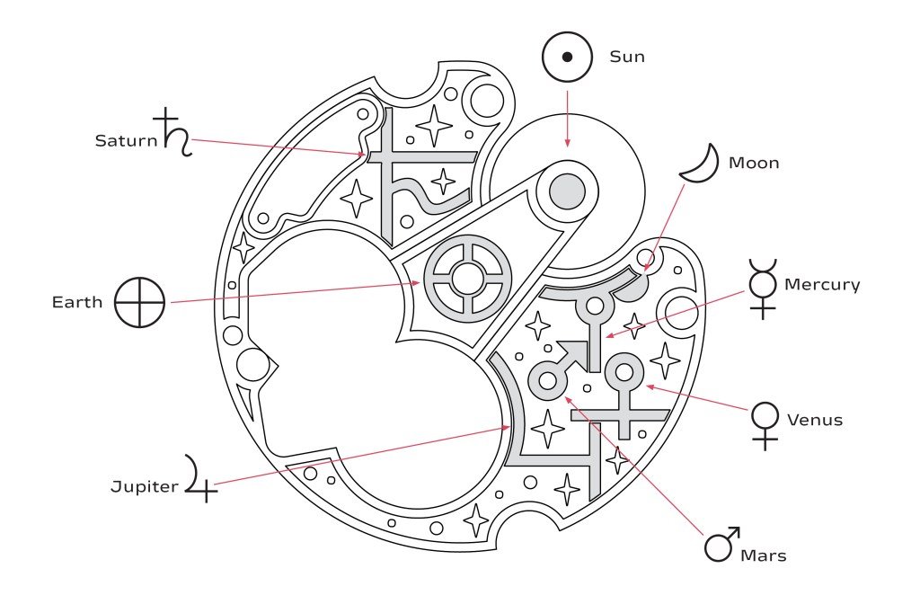
I also aided in designing the motif for the decoration of the movement. The only real restrictions were a set depth for engraving, and of course no changes to the position of jewels and screws. Kudoke’s normal presentation of their in-house Kaliber 1 movement reflects austere English and German watchmaking however previous special editions have gone with far more decorative flourishes for the top plates. Initially the main decision was whether to go with harmonic or contrasting decoration to the front of the watch. In terms of the actual subject of the decoration, I wanted to build upon the astrological theme from the hour emblems. The concept of incorporating planetary rulership sparked inspiration. Each zodiac sign has its ruling planet, and since the movement essentially controls what we see, it made conceptual sense to have the zodiac symbols on the dial working as domiciles to the movement. The classical ruling planets are Mars (for Aries and Scorpio), Venus (Taurus and Libra), Mercury (Gemini and Virgo) the Moon (Cancer), the Sun (Leo), Jupiter (Sagittarius and Pisces), and Saturn (Capricorn and Aquarius). Uranus, Neptune, and Pluto were also added as ruling bodies in modern astrology however I ended up sticking with the classical set.
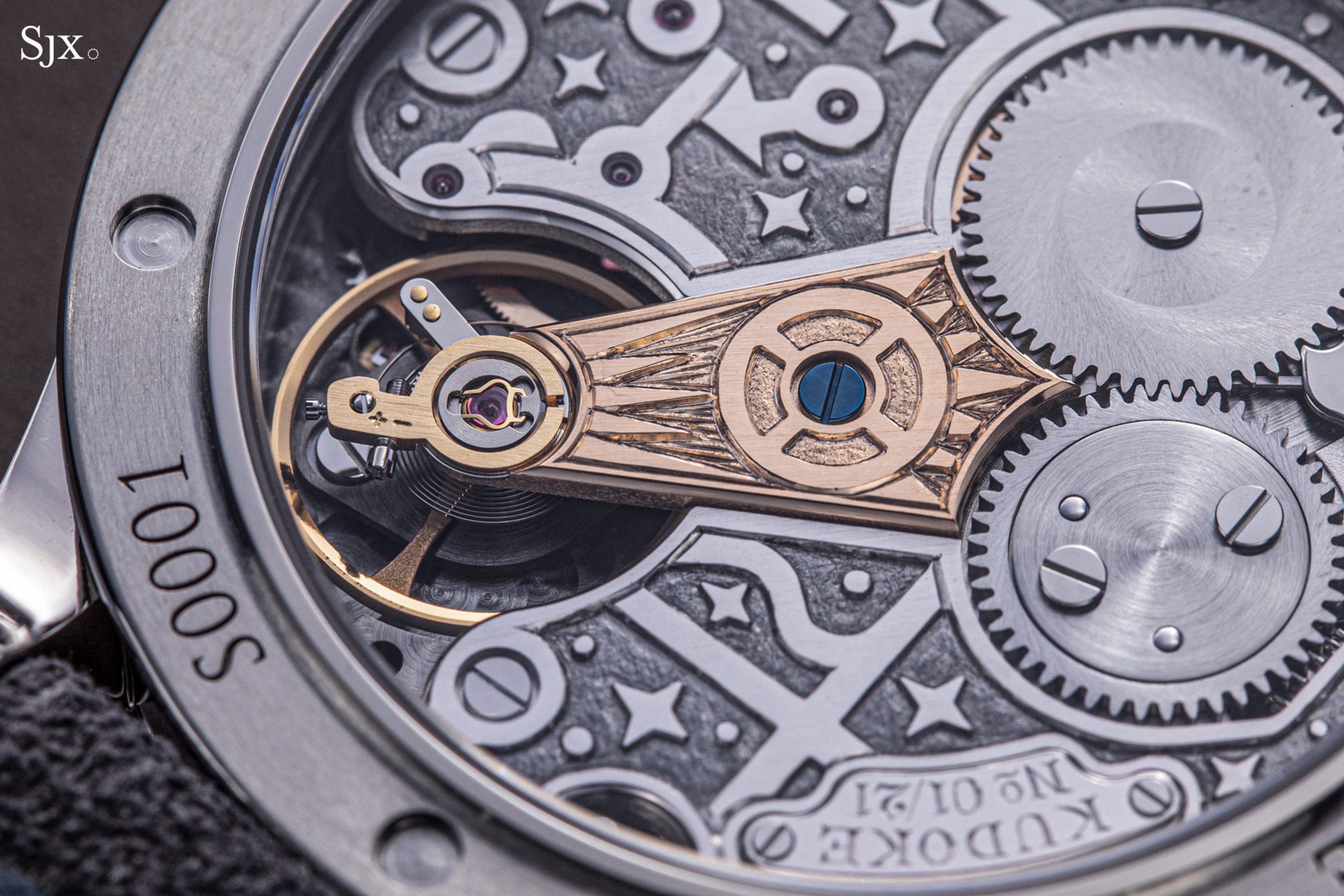
Since the Kaliber 1 uses a 3/4 top plate rather than multiple bridges, I was presented with a wide canvas for placing the ruling bodies. Several features made themselves candidates for decoration such as jewel bearings and screws. Conveniently, the movement had the same number of major wheels as planets for the classical ruling bodies. The two largest visible wheels were assigned to the largest planets with the ratchet wheel being paired with Jupiter and the crown wheel paired with Saturn. The jewel bearings for gear train made perfect hosts for Mercury, Venus, and Mars. The escape wheel was paired with the Moon while the balance wheel and its endstone represented the Sun symbol. I also included the symbol for Earth around the central blued screw of the balance cock. This made conceptual sense as Earth is a blue planet, and at the centre of astrology (since us humans made it up!).
After discussions with Kudoke, it was decided that a relief engraving similar to the dial would work best. I abstracted the symbols so they became more geometric and conformed to contours and alignments within the movement as well as removed superfluous elements. Care was taken to ensure they worked with each other and weren’t too busy when shown together. Decorative stars were added to activate the negative space and give the top plate a more even appearance, similar to how a designer strives for an even grey in a text typeface. SJX and Kudoke finalised the colours and decorative techniques which brought a fantastic vibrance into the watch.
I would like to thank SJX for including me in this stellar project, Ev Kudoke for her enthusiastic communication and input, and of course Stefan Kudoke whose expert handwork translated these motifs into a phenomenal watch. This project pushes the boundaries of horological typography and is a shining example of collaborative design within the industry.

1 Comment
Comments are closed.